Regional Studies Association
https://create.taylorandfrancis.com/wp-content/uploads/2020/08/homepage-rsa-scaled.jpgWhat Existed
The RSA website started life on a legacy content management system (CMS).
As the website grew, the amount of content became harder to manage and the legacy CMS did not make it easy to adapt.
The structure of the website became complex and it was easy to loose your way when navigating the website.
The old website was not responsive and therefore provided a difficult experience when accessed through mobile devices.
RSA felt their branding was outdated by new design trends and stifled their image as a forward thinking international association.
New Objectives
- Improve access to key information on the site
- Improve the event registration process
- Increase interest amongst members
- Promote the positives of applying for funding
Our Solutions
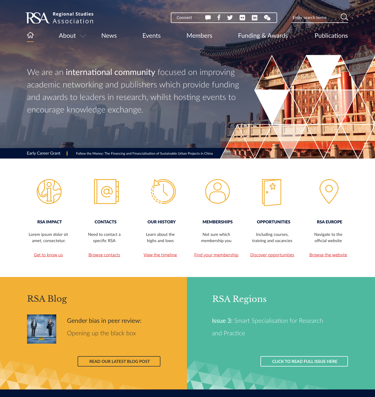
We re-designed the navigation and information architecture to ensure a consistent, relevant and logical journey to key information on publications, networks, news, research and the organisation.
We re-imagined the registration process so that visitors were provided with a user-friendly interface for accessing clear, and relevant information before deciding to register for an event.
In order to assist RSA members, we implemented a Google-powered map which displayed the location of RSA ambassadors around the globe.
We also updated the membership section so that benefits were clearly identified, and applying for different memberships were made easier.


Results
In November 2019 we launched the new RSA website. RSA reported positive feedback across the board from its members, ambassadors, researchers and stakeholders.
Post-launch, we continued to provide web support to RSA by extending the website features and making improvements following visitor feedback.
- Average time on page increased by 48% *
- Traffic on the Publication page increased by 6% *
- Traffic on the Membership page increased by 5% *
- Traffic on the Funding page by 6% *
* Compared 3 months after launch date with the previous year
Logo Concept 1
Logo Concept 2
Logo Concept 3
Homepage
Colour Palette
